
Whether we’re talking marketing analytics, political preferences or food trends, graphs are often used to communicate quantitative information in an easy-to-digest visual. And, when designed properly, they can be great tools for marketers and consumers alike.
But in the age of clickbait, where alarmist media is king, graphs with misrepresented data are everywhere. From a post on your Facebook newsfeed from your second cousin to the countries’ top news channels, every day we’re faced with graphs that are trying to sell a narrative. Some are definitely intended to manipulate, others are intended to shock and, in some cases, the graph is just unintentionally wrong.
As marketers and business leaders who depend on accurate information to make important recommendations and decisions, being able to discern and validate what a graph is trying to tell us is of the utmost importance. Below are four key things to keep top of mind when reading or designing a graph.
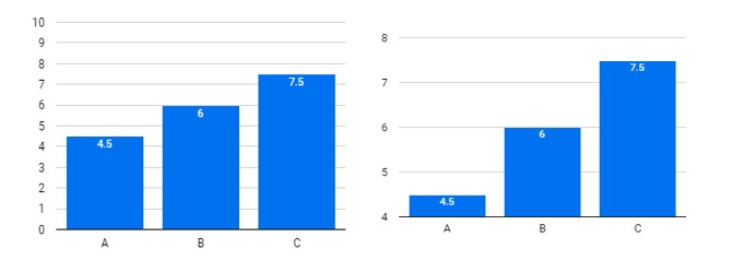
CHECK THE AXIS SCALE
1. A graph can be drastically altered by changing the scale of the axis. Where does your Y axis, or vertical axis, start? In general, most graphs should always show a baseline of zero on the vertical axis. Graphs that start at some arbitrary number tend to be very misleading. Take a look at the graph below. The data in the two graphs below are identical, but the way the Y-axis is scaled changes the impression of the variance. It’s also important to note that the scale doesn’t go up in even increments. This definitely will distort a graph and misrepresent data.
MONITOR SHOCK VALUE
2. If a graph is created to incite shock, then you should think critically and analyze if it’s missing data. When a graph isn’t visualizing a complete data set, you’re not getting all the information. You wouldn’t form an opinion of a movie or book by only finishing half of the content. Just like anything else in life, to make an educated, fully informed decision, you need all the information. In the first graph below, it would be accurate to say that 2020 averaged very few shooting stars.
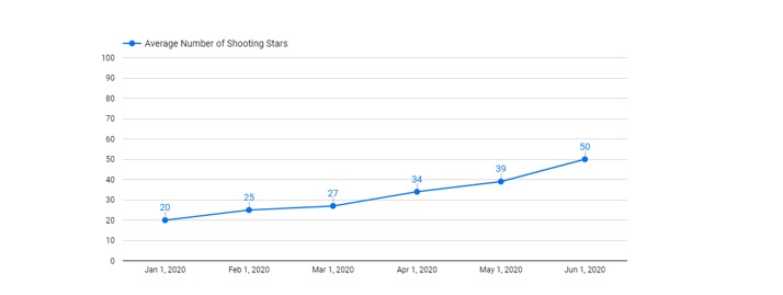
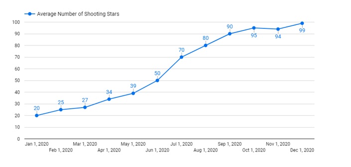
However, only the first half of the year is pictured. When we get all 12 months below, we can see that the second half of the year had a high number of shooting stars. Therefore, the statement “2020 averaged very few shooting stars” would no longer be accurate. This could also be a tactic used to minimize or accentuate fluctuations over time that, when seen from a broader view, could be part of a larger trend.
ANALYZE THE DATA
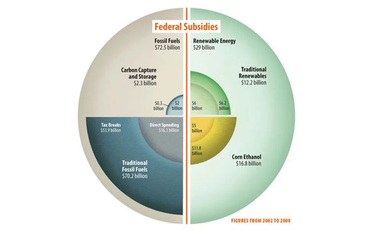
3. Always be diligent in analyzing if a graph even makes sense. For example, if you have a pie chart broken down into percentages, do the percentages add up to 100%? Do the percentages actually correlate with the size of the piece of pie? Can you even discern what the graph is trying to tell you? These are all things to be mindful of when reading a graph. Take the below, for example. Too much data, in the form of a “pseudo pie chart” that adds up to… what?
CHECK THE DATA POINTS
4. Another area to keep an eye out for is proper axis and data labels. If a graph has two Y-axes for example, it’s very confusing to discern what the graph is actually trying to say and can make for an apples-to-orange comparison or imply causation instead of correlation. These are often tactics used when the creator of the graph is trying to distract from the real data or imply causation without consideration for other factors not graphed.
In a time where data and graphs are often weaponized to support a narrative, it’s pertinent to be able to read a graph accurately and recognize if the graph is being used to misrepresent the data.
SHARE THIS: